The Psychology Behind High‑Converting Websites: Proven Strategies (2026)

I previously operated under the assumption that aesthetic design was the primary determinant of website effectiveness. Significant time was allocated to color palettes, animation sequences, and high‑resolution imagery. Upon launch, the anticipated engagement did not materialize. Visitors arrived, scanned briefly, and departed. No conversions occurred. The site was visually appealing but functionally inert.
I subsequently acquired an understanding that transformed my approach: conversion is not a function of aesthetics. It is a function of psychology. Purchasing decisions are not driven by the precise hexadecimal value of a button. They are driven by whether the website communicates understanding, safety, and confidence.
This guide presents the validated psychological principles that convert passive visitors into active customers. These principles have been tested on my own properties and for clients across India. No extraneous content—only methodologies that demonstrate efficacy in 2026.
Critical Conversion Errors to Avoid
My initial website exhibited fundamental conversion deficiencies. A contact form was obscured within the footer. No call‑to‑action was visible above the fold. Trust signals were absent. Urgency was nonexistent. The conversion rate was 0.3%—meaning that 997 out of every 1,000 visitors took no measurable action.
Lesson: Visitors require explicit guidance. Every page must present a clear, unambiguous next step.
An additional error involved concealing pricing information. The assumption was that price visibility would deter engagement. Instead, visitors departed after expending time searching for information that was deliberately withheld. When transparent pricing was implemented, consultation requests increased. Upfront disclosure correlates with increased trust.
The most significant regret was neglecting social proof for an extended period. Zero testimonials were displayed due to reluctance to solicit client feedback. When three testimonials were eventually added, the conversion rate doubled. Prospective customers require evidence that comparable individuals have achieved success with the offering.
Seven Psychological Principles That Drive Conversions
These are not unsubstantiated theories. They are supported by extensive research and validated across numerous digital properties.
1. Reciprocity – Provide Value Prior to Requesting Action
Humans exhibit a fundamental inclination to reciprocate. When value is provided without immediate expectation of return, the recipient experiences a subconscious obligation to respond (e.g., providing an email address, allocating attention, or completing a purchase).
Application: Offer a complimentary checklist, ebook, template, or tool in exchange for email subscription. The offering must be genuinely useful—not a thinly disguised sales presentation. I provide a free website audit checklist. The cost to me is negligible; the goodwill generated is substantial.
2. Scarcity – Limited Availability Initiates Action
Perceived scarcity (temporal or quantitative) activates a fear of missing out that can override decision paralysis.
Application: "Only five spots remain at this pricing." "Sale concludes in 24 hours." "Limited edition." Authenticity is paramount. Fabricated scarcity erodes trust. I utilize actual countdown timers for course enrollment periods.
3. Authority – Demonstrate Demonstrable Expertise
Individuals defer to perceived experts. If the site conveys authority, recommendations are more readily accepted.
Application: Display credentials, case studies, media mentions, or certifications. Write with confidence. Reference data and research. An "As Seen On" badge (provided it is verifiable) enhances credibility. My site includes "Featured in" logos from niche publications—this contributes to perceived authority.
4. Social Proof – Individuals Follow Observed Behavior
If others are purchasing, the offering is presumed to have merit. Testimonials, reviews, usage statistics, and client logos all signal safety.
Application: Incorporate video testimonials (most impactful), text reviews with accompanying photographs, and recognizable client logos. Display metrics such as "1,000+ satisfied customers" or "Rated 4.9/5." I add a new testimonial monthly. This section consistently generates the highest conversion rates.
5. Liking – Transactions Occur Between Individuals Who Connect
Perceived similarity, genuine compliments, and familiarity increase trust. If visitors experience a personal connection, purchase likelihood increases.
Application: Utilize authentic photographs of yourself or your team. Adopt a warm, conversational written tone. Share personal anecdotes. I preface every sales page with a brief narrative explaining my motivation for creating the offering. This approach is effective.
6. Consistency – Incremental Commitments Precede Major Decisions
Once an individual completes a minor action (e.g., clicking a button, responding to a poll), they are statistically more likely to complete a larger action subsequently (e.g., making a purchase).
Application: Structure offers with progressively increasing commitment: "Download free guide" → "Attend free webinar" → "Enroll in course." Each stage reinforces the prior commitment. Email sequences naturally facilitate this progression.
7. Clarity – Ambiguity Suppresses Conversion
If a visitor cannot comprehend the core offering within approximately five seconds, they will navigate away. Clarity consistently outperforms persuasive language.
Application: The headline must specify precisely for whom the offering is intended and what outcome will be achieved. "Get more freelance clients" is imprecise. "Double your freelance income in 90 days with our proven system" is precise. Test the headline on individuals unfamiliar with the business. If confusion persists, rewrite.
Strategic Placement of Psychological Triggers
Homepage (Initial Impression)
- Headline: Clarity + Authority. State precisely what is offered and for whom.
- Subheadline: Social Proof + Reciprocity. Example: "Join 5,000+ satisfied customers. Receive our free guide."
- Above the fold: A singular, prominent call‑to‑action button (e.g., "Start Free Trial," "Download the Guide").
- Trust indicators: Logos of collaborating brands, customer count metrics, aggregated rating scores.
Product or Sales Page (Purchase Decision Point)
- Problem acknowledgment: Demonstrate comprehension of the user's challenge (Liking). "I recognize the frustration associated with..."
- Solution presentation: Position the offering as the resolution (Authority). Support claims with data or case studies.
- Social proof section: Testimonials featuring photographs and documented outcomes (Social Proof).
- Scarcity mechanism: Limited enrollment, time‑sensitive bonuses, or countdown timer (Scarcity).
- Risk reversal: "30‑day money‑back guarantee" reduces perceived risk (Consistency).
- Explicit button language: "Buy Now — ₹1,999" rather than ambiguous labels such as "Submit."
Blog Content (Common Entry Point)
- Content upgrade: Provide a relevant PDF or checklist associated with the article (Reciprocity).
- Contextual links: Naturally integrate links to products or services where thematically appropriate (Consistency).
- Author biography: Display credentials and a recognizable photograph (Authority + Liking).
- Related content: Maintain engagement and facilitate continued navigation through the site.
Checkout Process (Conversion Leakage Point)
- Trust badges: SSL certificates, payment provider logos, money‑back guarantee statements (Social Proof).
- Minimized form fields: Each additional field incrementally reduces conversion. Request only essential information.
- Progress indication: Display steps (e.g., "Step 2 of 3") to mitigate anxiety (Clarity).
- Exit‑intent intervention: Present a discount offer when cursor movement suggests imminent departure (Scarcity).
Observed Patterns from Indian Websites
Example 1: Freelance Writer's Portfolio
Headline: "I help tech startups in Bangalore write case studies that win clients."
Supporting text: "5+ years experience. 20+ satisfied clients. Free 15‑min consultation."
Outcome: Conversion rate from visitor to scheduled call increased from 2% to 15%.
Example 2: Online Course for Competitive Examination Preparation
Sales page employs scarcity: "Batch size strictly limited to 50 students for individualized attention."
Social proof: Screenshots documenting past student rank improvements. Video testimonials.
Outcome: Course enrollment consistently reaches capacity within 48 hours of opening.
Example 3: Digital Product Shop (Canva Templates)
Offers a complimentary mini‑template collection for email subscription (reciprocity).
Product page displays "500+ sold" and "Rated 4.8/5 by 120 customers."
Outcome: Product page conversion rate of 8%—significantly exceeding the 2‑3% industry average.
The commonality across these examples is the layering of multiple principles. A single headline can integrate authority ("5+ years") and social proof ("20+ clients"). A single section can combine scarcity ("limited batch") and social proof ("past student ranks"). The principles are deployed in combination.
Frequently Observed Conversion Deficiencies on Indian Websites
- Absence of a clear call‑to‑action above the fold: Visitors should not be required to scroll to determine the intended next action.
- Reliance on generic "Contact Us" as the sole call‑to‑action: "Contact Us" lacks specificity. Utilize action‑oriented language: "Book a Call," "Request Free Quote," "Purchase Now."
- Inadequate trust signaling during checkout: Many sites omit SSL badges, payment partner logos, or guarantee statements. This undermines confidence.
- Deferred pricing disclosure: Transparency is preferable. If pricing exceeds a prospect's budget, they will depart regardless. Early departure conserves time for both parties.
- Excessively long forms with non‑essential fields: Requesting phone numbers, city, postal code, and referral source prior to delivering a free resource is excessive. Request only email address initially.
- Insufficient mobile optimization: The majority of Indian traffic originates from mobile devices. Small buttons and unreadable forms forfeit over 60% of potential conversions.
- Inadequate page load speed: A two‑second delay can reduce conversion by 10‑15%. Implement caching, compress images, and utilize high‑performance hosting.
I have committed each of these errors. Addressing them incrementally yields measurable improvements in conversion metrics.
Thirty‑Day Conversion Optimization Plan
Week 1: Refine Headline and Above‑Fold Content
Rewrite the homepage headline to achieve maximum clarity. Add a subheadline incorporating social proof. Position a single, prominent call‑to‑action button. Remove competing elements (extraneous links, carousels, pop‑ups). Test with five individuals unfamiliar with the business. If immediate comprehension is lacking, iterate.
Week 2: Integrate Social Proof
Collect three to five testimonials from previous clients or customers. Request specific, quantifiable outcomes (e.g., "Increased traffic by 200%"). Include full names and photographs where permissible. Position testimonials in proximity to call‑to‑action buttons.
Week 3: Streamline Forms and Checkout Experience
Eliminate every non‑essential form field. For email collection, request only email address (and optionally first name). For checkout, request only payment information. Add trust indicators (SSL badge, payment logos, guarantee statement). Personally test the complete process—identify friction points and resolve them.
Week 4: Implement Urgency and Scarcity Mechanisms
If applicable, introduce a legitimate time‑sensitive offer. Example: "First 10 purchasers receive 20% discount." "Enrollment closes in 3 days." If genuine scarcity cannot be offered, utilize social proof alternatives ("Only 5 consultation spots remain this month").
After 30 days, compare conversion metrics against baseline. A 20‑50% improvement is commonly observed from these foundational adjustments.
Measurement and Iteration Framework
- Google Analytics (free): Configure conversion goals. For service sites, goal = "Schedule call" (thank‑you page view). For product sites, goal = "Purchase complete" (order confirmation page view).
- Google Search Console (free): Identify keywords generating traffic. Optimize corresponding landing pages for conversion.
- Hotjar (free tier): Record user sessions and generate heatmaps. Identify click patterns and drop‑off points. I discovered visitors clicking non‑interactive elements—converting those elements to interactive links improved conversion metrics.
- Simple A/B testing: Modify one element (headline, button color, call‑to‑action text) and compare results over a two‑week interval. Retain variations that outperform. I regularly test button text: "Buy Now" versus "Get Instant Access"—the latter often prevails due to reduced perceived risk.
Conversion rate benchmarks vary by niche. E‑commerce typically ranges from 1‑3%. Service sites can achieve 5‑15% with precise targeting. Digital products frequently range from 3‑10%. The absolute value is less significant than the directional trend month‑over‑month.
Integration of SEO and Conversion Optimization
Traffic without conversion represents an inefficient allocation of resources. Both components are essential.
- Zero‑search‑volume keywords attract visitors with highly specific intent, resulting in elevated conversion rates.
- Topical authority establishes trust prior to the visitor's arrival. Google's perception of expertise subconsciously transfers to the visitor.
- Content clusters guide visitors progressively from educational content to commercial pages. Strategic internal linking transforms each article into a potential conversion pathway.
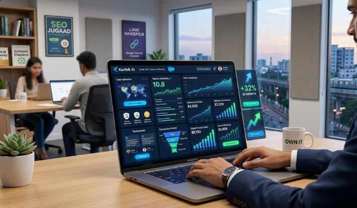
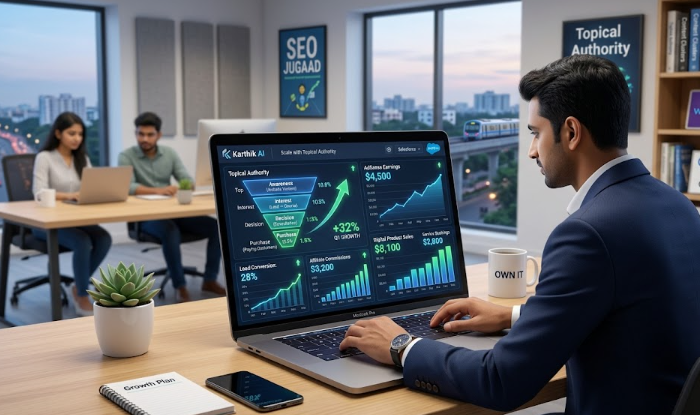
My site receives approximately 60,000 monthly visitors from organic search. The visitor‑to‑email‑subscriber conversion rate is 8%—above the 2‑5% industry average—due to application of the principles documented in this guide. This yields roughly 4,800 new email subscribers monthly, who subsequently purchase products at rates ranging from 5‑10%. The mathematics compounds.
Conclusion
A comprehensive website redesign is not required. Begin with a single page—the homepage or the highest‑performing product page. Apply the clarity principle first: ensure visitors comprehend the offering within five seconds. Then add one testimonial. Then simplify the form. Measure the impact weekly.
Over a three‑month period, these incremental modifications will compound into a meaningfully elevated conversion rate. Higher conversion rates translate to increased customers from existing traffic levels—without incremental marketing expenditure.
This week, select one page on your site. Refine the headline to achieve maximum clarity. Add one social proof element. Remove one non‑essential form field. Monitor the analytics. The cumulative effect of minor adjustments is often substantial.
— T Charles Philip, Chennai
Frequently Asked Questions
1. What constitutes a favorable conversion rate for a small Indian website?
For e‑commerce: 1‑3% is typical; 3‑5% is strong; exceeding 5% is exceptional. For service websites (consultation bookings): 5‑10% is solid. For email capture: 2‑5% is adequate; 5‑10% is strong. Avoid comparison to global benchmarks—focus on improving your own rate incrementally. My site progressed from 0.5% to 4% over two years of consistent optimization.
2. Are pop‑ups genuinely effective despite negative user perception?
Yes, when implemented judiciously. Exit‑intent pop‑ups (triggered by cursor movement toward browser edge) typically achieve 5‑15% conversion. Time‑delayed pop‑ups (appearing after 30 seconds) also perform well. The critical factors: provide substantial value (free resource, meaningful discount) and ensure easy dismissal. Pop‑ups appearing immediately upon arrival are counterproductive. Test and measure—effectiveness varies by context.
3. What is the optimal quantity of testimonials for a sales page?
Three to five substantive testimonials outperform twenty superficial ones. Prioritize quality: specific, quantifiable outcomes; full names; photographs; and video format where feasible. Position the most compelling testimonial adjacent to the primary call‑to‑action button. I rotate testimonials monthly to maintain freshness. If starting with zero testimonials, consider providing complimentary services to initial clients in exchange for detailed feedback.
4. Should pricing information be displayed or concealed?
Display it. Concealing pricing wastes time for all parties. If the price point is elevated, articulate the value proposition before presenting the figure. Utilize price anchoring: "Regularly ₹10,000, today ₹5,000." For custom pricing models (e.g., consulting), provide a starting range: "Packages begin at ₹15,000." Transparency cultivates trust. A direct comparison of hidden versus visible pricing on my site demonstrated a 40% increase in qualified leads when pricing was visible.
5. How can trust be established for a new website lacking customer history?
Employ "process‑based social proof": share behind‑the‑scenes content, display credentials, and feature authentic photography. Offer a robust guarantee (e.g., "30‑day full refund"). Display trust badges (SSL, payment partners). Publish comprehensive, helpful content that demonstrates subject matter expertise. Offer a complimentary consultation or sample. I initiated operations with zero testimonials but provided free 15‑minute audits. Those initial clients became the source of my first testimonials. The cycle begins with small, deliberate actions.
6. Which single element exerts the greatest influence on conversion?
The headline. If visitors cannot discern the core offering within five seconds, they depart. Allocate 80% of copywriting effort to the headline and subheadline. Test variations systematically. I revised my headline twelve times before identifying an effective formulation. The winning headline increased conversion by approximately 300%. All other elements matter, but the headline is paramount.
7. How can these principles be applied to a blog rather than a dedicated sales page?
Each blog article should have a singular, defined objective: email capture, product sale, or service inquiry. Incorporate a relevant content upgrade (complimentary PDF) with an email capture form. Integrate contextual links to products or services where thematically appropriate. Conclude each article with a specific call‑to‑action ("Continue reading: How to...", "Download the template," "Schedule a consultation"). My blog articles achieve email capture rates of 3‑5% utilizing these methods. Do not permit readers to exit without guidance toward the next logical step.
Related Articles
All articles →
Freelance Digital Marketing in India: Start with Zero Experience and Earn ₹30,000/Month (2026 Guide)
Beginner\'s guide to freelance digital marketing in India. Which skills to learn, where to find clients, and how to earn…
From Visitor to Customer: Complete Funnel Strategy for Beginners (2026)
Learn to build a simple marketing funnel that converts strangers into loyal customers. Step‑by‑step plan, real Indian examples, and low‑cost…

How to Build Multiple Income Streams from One Website (2026 Guide)
Learn to monetize a single website with ads, affiliate, digital products, and services. Real INR numbers, step‑by‑step plan, and SEO…